Pivot Tables
Pivot tables are used to generate grids of 1D (histogram) or 2D (biaxial) flow plots, bar graphs, heatmaps, line graphs, and dose response curves.
After selecting FCS file annotations, population names or channel names to use for the rows and columns of the grid, files are automatically selected to populate the figure.
For pivot tables of flow plots, a single FCS file can be displayed per position in the grid. For statistics plots, multiple files are allowed in each position, selected based on the dimensions used to set up the grid. If zero files match, or if multiple files match a single flow plot space, then the position will appear blank. Hover over the blank position for an explanation of why it is blank. Filter annotations can be used to reduce the number of matching files (see filter annotations described in the pivoting model).
Pivot tables can be nested to contain more than two dimensions (i.e. more than “rows” and “columns”), up to 10 levels, by clicking the add dimension button. For large pivot tables, also consider a batched illustration to create a multi-page view; this utilizes the pivoting model to automatically select groups of files for each page.
Organizing Pivot Tables with Metadata
Using your metadata to organize pivot tables allows rapid selection and presentation of various groups of files.
When setting up a grid of flow plots using annotation metadata:
Howto
- Insert a pivot table using the
 button in the toolbar.
 - Determine what combination of metadata will create a grid of individual files. This could be a single annotation value, or multiple values in combination, depending on your experiment design.
- If your table requires more than two dimensions, click on Add Dimension until the proper number has been added. For example, a table displaying T and B cells at each timepoint for each donor might require dimensions for Population, Timepoint, and Donor ID.
- For each dimension:
- Set the Name and Values of the dimension.
- If the dimension is not Rows or Columns, set the Direction to determine if the variables will create plots down or across the table.
- Repeat the above steps until all the desired variables are included as dimensions.
- To restrict file selection by metadata, under Filter Annotations, choose Add Filter and select the annotation name. If necessary, change the matching value by clicking on the dropdown box.
- Optionally, click
 or
or  to reorganize dimensions (for example, to switch Rows and Columns).
 - If the resulting pivot table is missing plots (for example, due to a sparse experiment design where not all patients have data for all timepoints), open the Pivot Table section and check Collapse empty rows and columns.
To use metadata to organize a pivot table of statistics plots:
Howto
- Set up a heatmap, dose response curve, bar graph, or line graph.
- To add a row or column of plots:
- Click on Add Dimension.
- Set the Name and Values of the new dimension.
- Set the Direction to determine if the variables will create plots down or across the table.
- Repeat the above steps until all the desired variables are included as dimensions.
- To restrict file selection by metadata, under Filter Annotations, choose Add Filter and select the annotation name. If necessary, change the matching value by clicking on the dropdown box.
- Optionally, click or to reorganize dimensions.
- If the resulting pivot table is missing plots (for example, due to a sparse experiment design where not all patients have data for all timepoints), open the Pivot Table section and check Collapse empty rows and columns.
Examples
These examples show small pivot tables for simplicity. However, pivot tables may contain hundreds or thousands of selections in each dimension.
Basic pivot table organized with metadata
Metadata is often the ideal way to organize a pivot table. The choice of metadata will depend on the goal of the figure and the experiment details.
Using metadata to organize pivot tables of flow plots
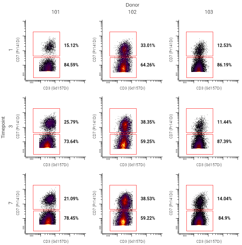
This example is from an experiment where samples were collected from donors at several timepoints. This information was added as annotations for each sample uploaded.
Using metadata for rows and columns in this case can allow for quick comparison of files by day or donor.
Howto
- Insert a pivot table using the button in the toolbar.
- In the sidebar, set up the pivot table dimensions as described in the pivoting model. In the example above, the settings are as follows:
- Columns ⮞ Name was set to Donor, and Values to “101”, “102”, and “103”
- Rows ⮞ Name was set to Timepoint, and Values to “1”, “3”, and “7”
- Under General, select the desired population, X channel, and Y channel.
- Optionally, adjust plot styling or insert text boxes for additional labeling. In this case, text boxes were added using the
 button in the toolbar to label the rows and columns (“Timepoint” and “Donor”).
Tip
If multiple files match the settings for a space in a pivot table, no plot will be displayed. You can further restrict file selection by filtering by annotations, or use additional metadata to create a nested pivot table.
Using metadata for dimensions of pivot tables of statistics plots
Metadata is also extremely useful for organizing pivot tables made with statistics plots.
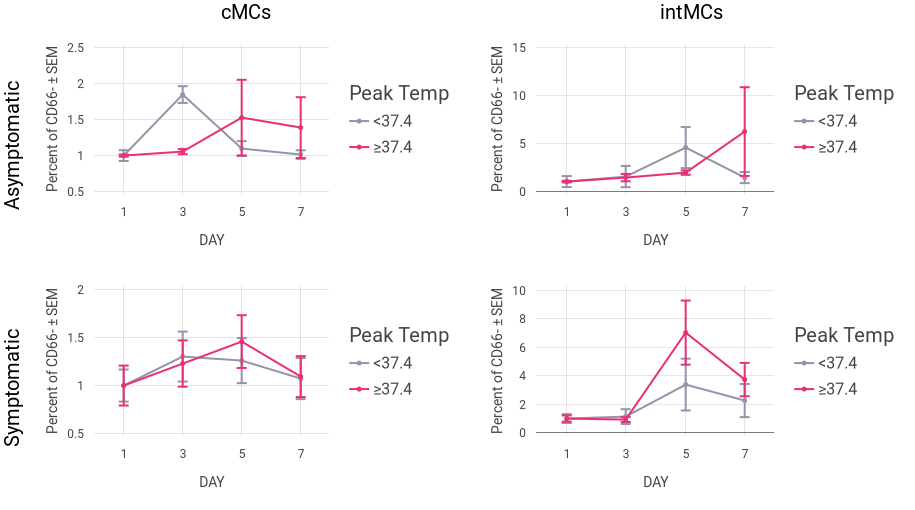
To make the above plot, a line graph was created using the following options:
Howto
- Insert a line graph using the
 button in the toolbar. Pivot tables can also be made starting from a bar graph, dose response curve, or heatmap.
 - In the sidebar, set up the plot's dimensions as described in the pivoting model. In the example above, the settings are as follows:
- Axis Labels ⮞ Name was set to Day, and Values to “1”, “3”, “5”, and “7”
- Legend Entries ⮞ Name was set to Peak Temp, and Values to “All values”
- Click Add dimension, and add additional dimensions that will be used for the pivot table. For this example, two additional dimensions were added:
- Dimension 3 ⮞ Name was set to Populations, and Values to “cMCs” and “intMCs”
- Dimension 4 ⮞ Name was set to Symptoms, and Values to “Asymptomatic” and “Symptomatic”
- Under General, select the desired statistic. If population was not used as a dimension, select that as well.
- Optionally, adjust plot styling or insert text boxes for additional labeling. In this case, a custom color palette was set in the Plot Settings.
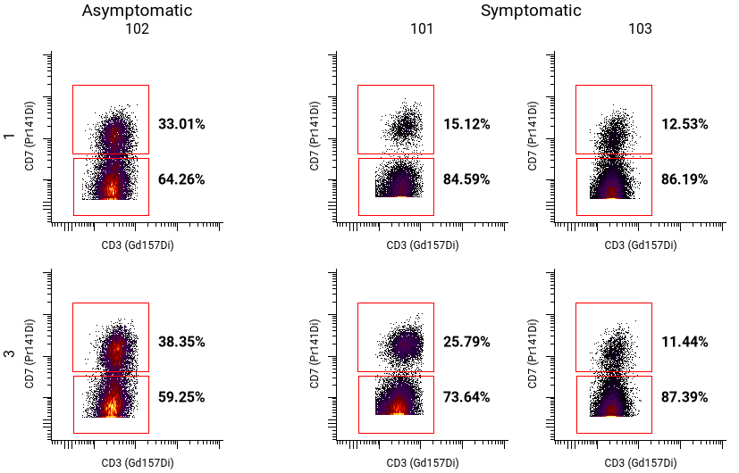
Creating nested pivot tables with metadata
In addition to using metadata for rows and columns, metadata can be used to nest and sort pivot tables. The example above uses donors and timepoints as organizational elements, but some donors developed symptoms, while others did not. That can be used to further organize the pivot table:
Howto
- Insert a pivot table using the button in the toolbar.
- Set up the pivot table rows and columns. In the example above, the settings are as follows:
- Columns ⮞ Name was set to Donor and Values to “101”, “102”, “103”
- Rows ⮞ Name was set to Timepoint and Values to “1” and “3”
- To add an additional dimension, click on Add Dimension. This example uses only one additional dimension (Dimension 3).
- Select a Name and Values for each additional dimension. For the example above, the Name is Symptoms, and Values are “Asymptomatic” and “Symptomatic”.
- Under General, select the desired population, X channel, and Y channel.
- If the pivot table is sparse, under Pivot Table, check Collapse empty rows and columns. For this example, patients were classified as either asymptomatic or symptomatic, so this option was used to remove empty columns.
Tip
Adding more metadata to Annotations allows rapid iteration of figures. Consider including information about the sample (e.g. treatment or tissue origin), donor (e.g. demographic data or cell line information), and experiment (e.g. cohort or preparation date) for comparing different file subsets easily.
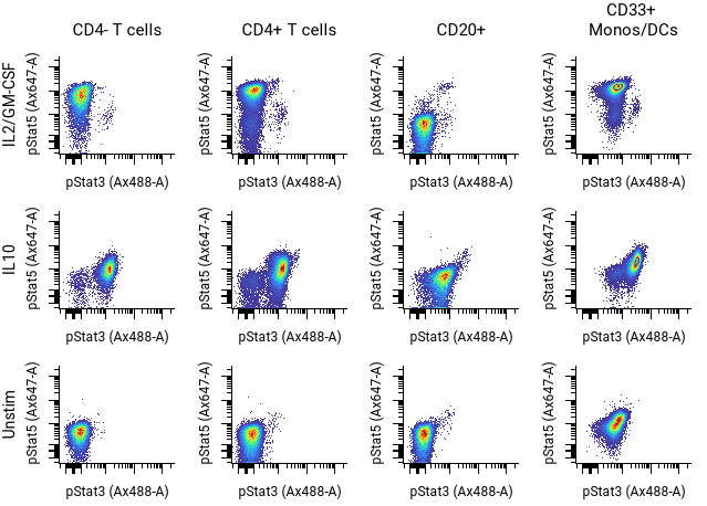
Basic pivot table of flow plots organized with populations and channels
Howto
- Insert a pivot table using the
button in the toolbar.
- Set up the pivot table dimensions as described in the pivoting model.
In the example above, the settings are as follows:
- Columns Populations: CD4- T cells, CD4+ T cells, CD20+, CD33+ Monos/DCs
- Rows Condition: IL2/GM-CSF, IL10, Unstim
- Select the X and Y channels and other settings in the sidebar and toolbar as desired.
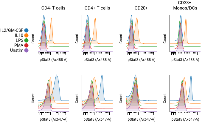
Histogram overlays
Howto
- Insert a pivot table using the
button in the toolbar.
- In the top toolbar, change the plot type to histogram.
- Set up the pivot table dimensions as described in the pivoting model. In the example above, the settings are as follows:
- Columns Populations: CD4- T cells, CD4+ T cells, CD20+, CD33+ Monos/DCs
- Rows Condition: IL2/GM-CSF, IL10, LPS, PMA, Unstim
- Table 1 X Channels: pStat3, pStat5
- Check the Overlay box for the dimension to overlaid. In the example above, the rows (condition) dimension is overlaid. Adjust the pitch as desired.
- Adjust styling as desired under Plot Settings. The histogram fill opacity, plot smoothing, and color palette can all be adjusted.
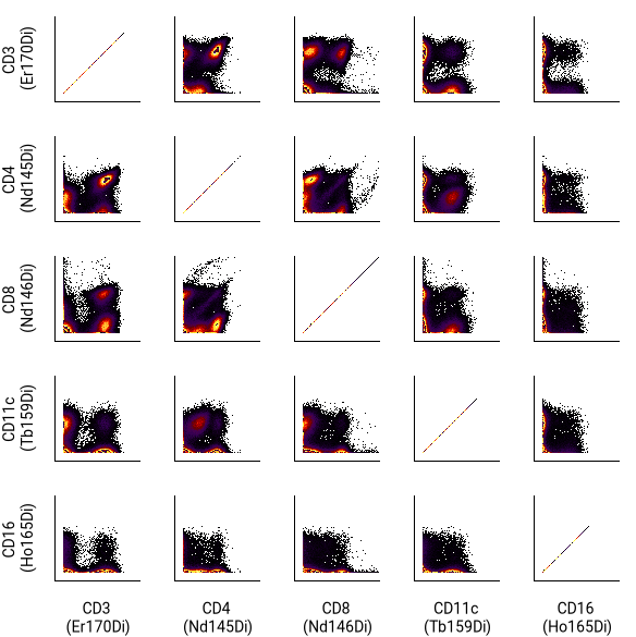
N x N (channel by channel) plots
Howto
- Insert a pivot table using the button in the toolbar.
- In the right sidebar, set the Columns dimension name to X Channels. In the values selector, pick which channels to display.
- Set the Rows dimension name to Y Channels. In the values selector, select Same as X Channels at the top.
- Set general parameters such as filter annotations, the FCS file, population and gate labels in the sidebar.
- For a simpler view like the one shown above, go to the Axes and Legend section and turn off tick marks and axis labels.
- Change label font sizes or move column labels to the bottom of the table by choosing options in the Pivot Table section.
Tip
To view the N x N illustration for each file or annotation combination, turn on batched illustration mode.
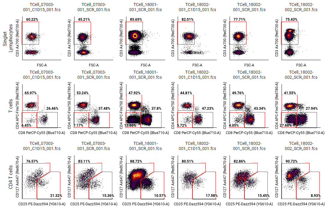
Review gating on multiple files
Howto
- Insert a pivot table using the button in the toolbar.
- In the right sidebar, set the Columns dimension Name to FCS Files. Set values to All values (or select a group of files to display). Alternatively, select one or more annotation names that together uniquely select each FCS file. For example, you could select the Donor ID and timepoint. If your experiment design is sparse, use Collapse empty rows and columns under Pivot Table.
- For Rows, set Name to Populations.
- Under Rows, click on Values to show the population hierarchy.
- Hover over the population you want to display, and click on show on parent (
 ).
). - Optional: Select any other gates in the hierarchy that share the same channels and that you want to see at the same time. For example, if there is a gate identifying IL-1-producing cells, and the gate is gated under T cell, macrophage, and B cell populations, select each of the IL-1 gates as a value under Rows.
- For each additional gate for review:
- Copy and paste the pivot table.
- Change the Rows ⮞ Values to a different population using show on parent ().
Backgating (biaxial plot overlay)
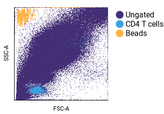
This example focuses on backgating. See visualizing algorithm results for additional examples of overlaid biaxial plots.
Howto
- Insert a pivot table using the button in the toolbar.
- In the right sidebar, select the desired FCS files.
- To select with annotation metadata:
- Use dimensions and filters to select your files.
- To select by filename:
- Change Columns ⮞ Name to FCS Files.
- Select Columns ⮞ Values and choose your files.
- To select with annotation metadata:
- Configure Rows:
- Click on Name and choose Populations.
- Click on Values and select the populations you want to view. In the example above, the “Ungated”, “CD4 T cells”, and “Beads” populations were selected.
- Check the Overlay box.
- If some of your populations are obscured by other populations, you can adjust the sort order of the plot. When a row of plots are overlaid, the sort order determines the order of the overlay. Thus, populations may need to be moved so that smaller, overlapping populations are visible. In this example, the “Ungated” population initially obscured the other populations. To alter the sort order:
- Click on Change display order (
 ) under Rows.
 - Select the obscuring population(s).
- Adjust the position with the move buttons.
- Select Save Order.
- Click on Change display order (
- In General, change the X and Y channels as needed.
- Optional: Change styling options. This example turned off tick marks and column labels under Pivot Table, and changed Plot Settings to use a custom color palette.
Common Settings
Adjusting the order of values
When you select annotations, populations and channels, they will be automatically sorted. However, you can override the default sorting by following the instructions in annotation, population and channel sorting.
Change gate appearance
By default any gates in a pivot table plot will be shown, along with the percent of events contained within the parent gate.
The Gates section allows you to:
- Show/hide gates in the pivot table
- Change label size of gates
- Change a gate label to the gate name or a statistic about the gated population.
Tip
To adjust the gate shown in a plot, right-click on the plot and click View in gating.
Dimension spacing and label size
In the sidebar under Pivot Table, a font size and spacing section allows adjusting the following settings for each dimension:
- The label font size
- The label visibility (show/hide)
- Spacing between dimension values
To keep labels visible as you scroll:
Howto
- Click on the View menu.
- Select Sticky Labels.
Collapsing empty rows and columns
In some experiments, a pivot table may be sparse, meaning that not every combination of every annotation value exists. For example, in a clinical trial with annotations for “donor ID” and “timepoint,” not every donor might have been sampled at every timepoint. In experiments with at least three annotation columns, this sparsity can result in entire rows and/or columns that are blank.
To collapse these blank rows and columns, toggle on the collapse empty rows and columns option in the Pivot Table section of the sidebar.
Plot styling
Pivot tables can use the flow plot styling options. Styling options are found in the Axes and Legend, Plot Settings, and Gates sections.
Color palettes can be customized from Plot Settings when overlay options are turned on.