Analysis Algorithms
CellEngine provides machine learning, dimensionality reduction, and clustering algorithms for exploratory analysis.
Running Algorithms
Howto
- Before starting, check that your scales and compensation are set correctly. These can be viewed and adjusted on the gating page.
- Click algorithms in the left sidebar to open the analysis algorithms page.
- Select common parameters:
- Population selects which population to analyze. Typically this is a singlets or leukocyte gate, excluding debris.
- FCS Files selects which files to analyze.
- If a warning is shown that the number of events exceeds the maximum number of analyzable events, turn on subsample events. You can either select a percentage of events from each file (for proportionate subsampling across files), or an absolute number (for equal subsampling). Specifying a random seed will select the same events every time.
- Analysis Channels selects which channels to use for analysis. Typically these are all of your surface markers, but could include signaling markers and physical parameters (scatter for fluorescence cytometry, DNA and event length for mass cytometry).
- Rescale channels equally makes each channel have equal weight during analysis. This should usually be left on because it prevents a channel from having too much or too little influence. Rescaling uses your scales’ minima and maxima, so again, ensure that your scales are set correctly.
- Compensation selects which compensation matrix to apply.
- Pick which algorithm(s) to run and set their algorithm-specific parameters. See the sections below for information on each. CellEngine lets you select multiple algorithms to run in a pipeline, making it easy, for example, to display clustering results on a UMAP plot.
- Click run. The analysis will run in the background; you can leave the page or close the browser. To monitor the analysis status, click on the activity tracker in the top-right corner.
- When the analysis is complete, a new experiment will be created. You can access it from your inbox or the activity tracker.
Which algorithms should I use?
This is largely a matter of personal preference. For dimensionality reduction, while UMAP is generally noted for its speed, the implementation of t-SNE in CellEngine is about as fast as UMAP. Through tuning of each algorithm’s settings, the results of both can be made to look very similar.
Dimensionality Reduction
Dimensionality reduction algorithms are visualization tools that create two-dimensional views of higher-parameter datasets.
Principal Component Analysis (PCA)
PCA is a linear transformation that preserves as much of the variation in the data as possible in two dimensions. It is deterministic (repeatable) and fast, but because it is a linear transformation, its utility can be limited.
CellEngine’s implementation of PCA can analyze up to 30 million events in about 1 minute.
The following settings are available:
- Number of components sets the number of dimensions to which to reduce the dataset. For visualization, this is commonly set to 2, but can be set to higher values for very high-dimension datasets (e.g. sequencing) where 10,000s of dimensions might be reduced to 10s of dimensions for further computational analysis.
t-Distributed Stochastic Neighbor Embedding (t-SNE)
t-SNE is a non-linear transformation conceived by Hinton and van der Maaten and first applied to cytometry data by Amir et al.
While the original t-SNE algorithm is computationally limited to about 10,000 data points, CellEngine uses a fast approximation that can analyze up to 10,000,000 data points in about 30 minutes. If necessary, larger datasets can be subsampled to meet this cap.
To improve reproducibility between runs and statistical rigor, CellEngine uses the first two principal components instead of random noise to initialize the algorithm.
The following settings are available:
- Perplexity is a smooth measure of the effective number of neighbors, typically between 5 and 50. Lower values emphasize local effects in the data, while higher values emphasize global effects and are necessary for larger datasets.
- Number of nearest neighbors (k) adjusts how many neighboring data points are used to compute the perplexity matrix and has similar effects as perplexity. This should be at least three times the perplexity.
- Number of iterations controls the number of gradient descent (optimization) iterations. In each iteration, the position of each point is adjusted slightly.
- Number of exaggeration iterations controls how many of the gradient descent iterations use the early learning rate, early exaggeration and (internal) early momentum. The goal of this phase is to avoid local minima.
- Early and late learning rate affect the spacing of the points. A rate that is too high can cause the result to “ball up,” while a rate that is too low can cause events to not group together well. The learning rate can be specified separately for the early and late phases, but are usually best set to the same value.
- Early and late exaggeration adjust the attractive forces and thus how tight the groups are. Increase the final exaggeration slightly to make the groups smaller and more spread out, especially for larger datasets.
CellEngine suggests default values for each of these parameters in the algorithm settings page.
It’s perfectly valid to run t-SNE multiple times with the same or different settings and pick the result that looks the best.
Warning
t-SNE results can be misleading and tricky to interpret: using different settings can produce dramatically different results, cluster sizes are meaningless, the distances between clusters might not mean anything, and shapes can appear in both random noise and in real data. See The Specious Art of Single-Cell Genomics and How to Use t-SNE Effectively for excellent advice on this topic.
For more information:
- van der Maaten L., Hinton G. Visualizing data using t-SNE at https://jmlr.org/papers/volume9/vandermaaten08a/vandermaaten08a.pdf - The “t-distributed” variant of SNE.
- Amir E.D., Davis K.L., Tadmor M.D., Simonds E.F., Levine J.H., Bendall S.C., Shenfeld D.K., Krishnaswamy S., Nolan G.P., Pe’er D. viSNE enables visualization of high dimensional single-cell data and reveals phenotypic heterogeneity of leukemia at https://pmc.ncbi.nlm.nih.gov/articles/PMC4076922/ - The first application of t-SNE to cytometry data.
- Wattenberg M., Viégas F, Johnson I. How to Use t-SNE Effectively at https://distill.pub/2016/misread-tsne/ - Guidance on using and interpreting t-SNE.
- Chari T., Banerjee J., Pachter L. The Specious Art of Single-Cell Genomics at https://www.biorxiv.org/content/10.1101/2021.08.25.457696v3.full - Discussion of dimensionality reduction analysis and t-SNE and UMAP interpretation.
- Melville J. smallvis documentation at https://jlmelville.github.io/smallvis/ - Thorough investigation of the various t-SNE settings.
- Kobak D., Berens P. The art of using t-SNE for single-cell transcriptomics at https://www.nature.com/articles/s41467-019-13056-x - Includes guidelines for tuning t-SNE settings that apply to both single-cell transcriptomics and cytometry.
Uniform Manifold Approximation and Projection (UMAP)
UMAP is a non-linear transformation developed by McInnes, Jealy and Melville and is similar to t-SNE.
CellEngine’s implementation of UMAP can analyze up to 10,000,000 data points in about 20 minutes. If necessary, larger datasets can be subsampled to meet this cap.
The following settings are available:
- Number of nearest neighbors (k) adjusts how many neighboring data points are used to compute forces. Lower values emphasize local effects in the data, while higher values emphasize global effects and are necessary for larger datasets.
- Number of iterations controls the number of gradient descent (optimization) iterations. In each iteration, the position of each point is adjusted slightly.
- Minimum distance controls the spread of clusters. Smaller values result in denser clusters, while larger values result in more disperse clusters.
For more information:
- McInnes L., Healy J., Melville J. UMAP: Uniform Manifold Approximation and Projection for Dimension Reduction at https://arxiv.org/abs/1802.03426
- Becht E., Dutertre C.A., Kwok I.W.H., Ng L.G., Ginhoux F., Newell E.W. Evaluation of UMAP as an alternative to t-SNE for single-cell data at https://www.biorxiv.org/content/10.1101/298430v1.
Clustering and Community Detection
Clustering and community detection algorithms identify similar groups of cells, potentially replacing some aspects of manual gating.
FlowSOM
FlowSOM is a clustering algorithm based on self-organizing maps (SOM) developed by Van Gassen et al. Briefly, the algorithm stages are:
- A SOM is trained. The SOM is a rectangular, non-toroidal grid. In each iteration, FlowSOM refines the map using a randomly selected event from the dataset: First it finds the nearest existing grid point, then it updates that grid point and neighboring grid points’ positions in n-dimensional space to incorporate the new event.
- The dataset is mapped to the SOM.
- Optionally, consensus clustering is run on the SOM. During this step, a random subset containing 90% of the SOM distance matrix is selected, then hierarchically clustered.
- Either the consensus matrix or the SOM itself is hierarchically clustered to yield “meta-clusters.”
CellEngine’s implementation of FlowSOM can analyze up to 400,000,000 data points in about 1 minute.
The following settings are available:
- X and Y grid size adjust the adjust the number of points in the map. Datasets with more cell populations require larger grid sizes to separate them. x times y must be less than 10,000. Larger grids take more iterations to converge.
-
Training iterations controls how many iterations are used to train the map.
Note that CellEngine selects one cell per “iteration,” whereas Van Gassen’s implementation iterates through every cell in the dataset per “iteration.” Consequently, the number of iterations in CellEngine is much higher, but also generally does not need to be adjusted according to the size of the dataset.
-
Start radius affects how many neighboring grid points are updated during the training phase. The end radius is always 0, meaning only the nearest grid point’s position is updated without updating neighbors.
- Consensus clustering iterations sets how many times the map is subsetted and clustered. This can be set to 0 to skip consensus clustering and just use standard hierarchical clustering.
- Number of consensus clusters sets how far up the dendrogram is “cut” when observing co-clustering. Note that this is not the final number of meta-clusters. CellEngine allows you to dynamically select the number of meta-clusters after FlowSOM runs, providing more flexibility. However, this number should be close to the number of meta-clusters in your dataset.
- Random seed seeds the random number generator so that consistent results are obtained across runs. If left blank, a random number will be used for the seed each time the algorithm runs.
The output of FlowSOM in CellEngine is a new experiment with FCS files that contain two additional columns: (1) the SOM cluster ID and (2) the Euclidean distance of the cell from its assigned cluster. Additionally, the results of the meta-clustering are stored. On the gating page, you can select how many meta-clusters to visualize without having to re-run FlowSOM by clicking create cluster gates in the lower-left.
Key Differences from Van Gassen’s Implementation
- CellEngine does not create a graph with a minimum-spanning tree (MST) or the “star plots” shown in the original publication. Instead, the results can be viewed on any of CellEngine’s other visualization types, including t-SNE and UMAP plots, heatmaps, and pivot tables.
- As described above, CellEngine selects one cell per “iteration,” whereas Van Gassen’s implementation iterates through every cell in the dataset per “iteration.”
For more information:
- Kohonen T. Self-Organized Formation of Topologically Correct Feature Maps at https://doi.org/10.1007%2Fbf00337288
- Van Gassen S., Callebaut B., Van Helden M.J., Lambrecht B.N., Demeester P., Dhaene T., Saeys Y. FlowSOM: Using self-organizing maps for visualization and interpretation of cytometry data at https://onlinelibrary.wiley.com/doi/full/10.1002/cyto.a.22625
Louvain, Leiden and Ensemble Clustering of Graphs (PhenoGraph)
The Louvain community detection algorithm was adapted to cytometry data by Levine et al. in a method named PhenoGraph. Briefly, PhenoGraph works as follows:
- k nearest neighbors (kNN) are selected for each cell.
- A graph is created from the adjacency matrix, with the edge weights set to the Jaccard similarity between nodes.
- A community detection algorithm is run on the graph to find optimal partitions. See below for information on the choice of algorithm.
The original PhenoGraph publication used the Louvain algorithm. Since then, the Leiden algorithm has largely superseded Louvain, which addresses a defect in the Louvain algorithm by which communities may be poorly connected. CellEngine also offers ensemble clustering for graphs, which is a consensus clustering method based on the Louvain algorithm; however, in our experience, this algorithm performs worse and is somewhat slower than Leiden and Louvain.
CellEngine’s implementation of these algorithms can analyze up to 10,000,000 data points in about 15 minutes.
The following settings are available:
- Number of nearest neighbors (k) adjusts how many neighboring data points are used to compute forces. Lower values emphasize local effects in the data, while higher values emphasize global effects and are necessary for larger datasets.
- Resolution adjusts the number vs. size of communities. A lower number yields fewer, but larger, communities. (Louvain and Leiden only.)
- Ensemble size determines how many graph partitions are used to calculate the consensus. (ECG only.)
- Minimum edge weight prunes weak relationships from the graph. Higher values lead to fewer, but larger, clusters. (ECG only.)
Key Differences from Levine’s Implementation
- The original Levine implementation using Louvain bootstraps the analysis several times, then selects the optimal result. CellEngine does not perform this step because it only marginally improves results at the cost of significantly slower runtime. Recent updates to the Pe’er lab PhenoGraph implementation that added the Leiden algorithm omitted this bootstrapping step as well.
After running a community detection algorithm, the resulting analysis experiment will contain a set of gates that define the communities. The communities are numbered by decreasing size, so if you wish to have a minimum cluster size, you can simply omit higher-numbered clusters from your interpretation and/or create a new range gate encompassing the outlier cluster IDs. Note: CellEngine creates up to 200 cluster gates. Analyses with more clusters (for example, due to a very low k or very high resolution) will contain an “outlier” gate.
For more information:
- Levine J.H., Simonds E.F., Bendall S.C., Davis K.L., Amir E.D., Tadmor M.D., Litvin O., Fienberg H.G., Jager A., Zunder E.R., Finck R., Gedman A.L., Radtke I., Downing J.R., Pe’er D., Nolan G.P. Data-Driven Phenotypic Dissection of AML Reveals Progenitor-like Cells that Correlate with Prognosis at https://www.cell.com/cell/fulltext/S0092-8674(15)00637-6
- Blondel V.D., Guillaume J., Lambiotte R., Lefebvre E. Fast Unfolding of Communities in Large Networks at https://arxiv.org/pdf/0803.0476.pdf
- Traag V.A., Waltman L., van Eck N.J. From Louvain to Leiden: Guaranteeing Well-Connected Communities at https://www.nature.com/articles/s41598-019-41695-z
- Poulin V., Théberge F. Ensemble Clustering for Graphs at https://arxiv.org/abs/1809.05578
- Poluin V., Théberge F. Ensemble Clustering for Graphs: Comparisons and Applications at https://arxiv.org/pdf/1903.08012.pdf
Interpreting Algorithm Results
There are many approaches to visualizing and interpreting results from dimensionality reduction algorithms, several of which are outlined here. These can be further combined and adjusted according to your experiment design.
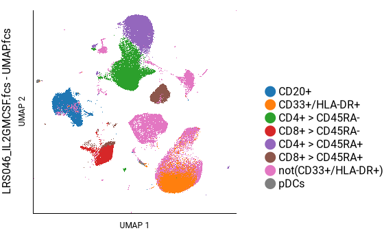
Approach 1: Using manual gates and plots colored by markers
The first approach uses manual gating to define major cell populations and create a “key” plot to help navigate other plots. The other plots can be colored either by phenotyping markers to further subclassify those populations, or by signaling markers to determine what the populations are doing.
Creating the key plot
Howto
- Create a new illustration.
- Insert a pivot table using the
 button in the toolbar.
 - Apply the following settings:
- Dimensions ⮞ Columns Populations: your populations of interest. Check the Overlay checkbox.
- Dimensions ⮞ Rows FCS Files: Generally a single file is sufficient to serve as a key when viewing other plots, but multiple files can be selected if desired (e.g. if some samples are biologically missing a population).
- General ⮞ Y Channel and General ⮞ X Channel UMAP 1 and UMAP 2, t-SNE 1 and t-SNE 2, or PCA 1 and PCA 2.
- Axes and Legend ⮞ Tick Marks Optionally deselect to tidy up the plot; they are meaningless.
Tip
The order in which the populations are overlaid can be adjusted by following the instructions in annotation, population and channel sorting.
This plot can now serve as a reference to help navigate other plots.
Subclassifying populations using phenotyping markers
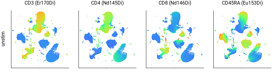
Here we can see that CD3+ cells are in the top-center and lower-left; CD4+ cells are in the top-center and CD8+ cells are in the lower-left; and CD45RA+ cells form a continuum within each of those, as well as within the B cell population on the left. This agrees well with the key plot, above.
Howto
- Start from the illustration created earlier.
- Insert another pivot table using the button in the toolbar.
- Apply the following settings:
- Dimensions ⮞ Columns Color Channels: your phenotyping channels of interest. In the example above, CD3, CD4, CD8, and CD45RA are selected.
- Dimensions ⮞ Rows An annotation of your choice, sufficient to select the files you want to view. In the example above, it’s our “condition” annotation with “unstim” selected.
- General ⮞ Y Channel and General ⮞ X Channel UMAP 1 and UMAP 2, t-SNE 1 and t-SNE 2, or PCA 1 and PCA 2.
- Axes and Legend ⮞ Tick Marks Optionally deselect to tidy up the plot; they are meaningless.
- If you have replicate samples, add additional pivot table levels by clicking the add table button, use Filter Annotations to narrow down the displayed files, or enable batched mode to create a multi-page illustration.
Tip
The order in which the pivot table rows and columns appear can be adjusted by following the instructions in annotation, population and channel sorting.
This same approach can be used to gate the “blobs” in the gating page:
Howto
- Open the gating page.
- Set the X and Y channels to UMAP 1 and UMAP 2, t-SNE 1 and t-SNE 2, or PCA 1 and PCA 2.
- Set the plot type in the left panel to “Dot.”
- Select a color channel in the left panel.
- Draw gates as desired, according to the plot colors.
Inspecting cell activity using signaling markers
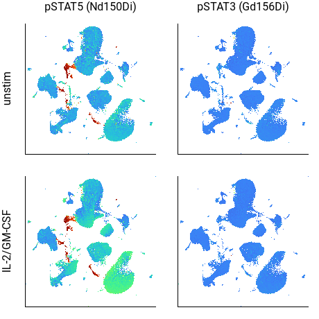
Although subtle, in the above example the CD33+/HLA-DR+ cells in the lower-right corner of the pSTAT5 plot are a brighter color in the IL-2/GM-CSF sample, indicating increased STAT5 phosphorylation. (The cells in red are potentially debris.)
Howto
- Start from the illustration created earlier.
- Insert another pivot table using the button in the toolbar.
- Apply the following settings:
- Dimensions ⮞ Columns Color Channels: your signaling channels of interest. In the example above, pSTAT3 and pSTAT5 are selected.
- Dimensions ⮞ Rows An annotation of your choice, across which you want to compare signaling behavior. In the example above, it’s our “condition” annotation with “unstim” and “IL-2/GM-CSF” selected.
- General ⮞ Y Channel and General ⮞ X Channel UMAP 1 and UMAP 2, t-SNE 1 and t-SNE 2, or PCA 1 and PCA 2.
- Axes and Legend ⮞ Tick Marks Optionally deselect to tidy up the plot; they are meaningless.
- If you have replicate samples, add additional pivot table levels by clicking the add table button, use Filter Annotations to narrow down the displayed files, or enable batched mode to create a multi-page illustration.
Tip
The order in which the pivot table rows and columns appear can be adjusted by following the instructions in annotation, population and channel sorting.
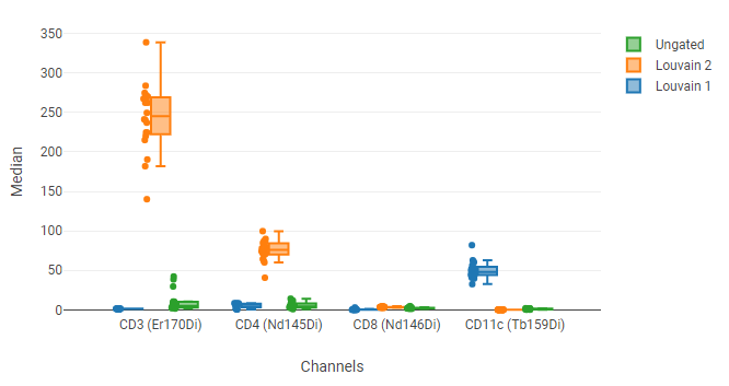
Approach 2: Using box plots to compare blobs
This approach involves drawing polygon gates around blobs, and then using a box plot to compare the phenotyping or signaling markers between blobs.
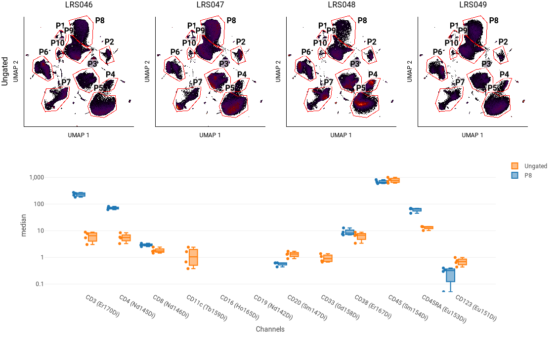
In this example, the four plots at the top show the UMAP blobs for each of four replicate samples. We previously drew 10 gates around the blobs, named P1 through P8. Below that is a box plot showing the median of several phenotyping markers for all events (“Ungated”) and for a selected blob (P8). We can use this to see that P8 has relatively high CD3 and CD4 staining, indicating that it represents CD4+ T cells.
Howto
- Draw polygon gates around blobs in the gating page.
- Create a new illustration.
- Insert a pivot table using the button in the toolbar.
- Apply the following settings:
- Dimensions ⮞ Columns An annotation and its values of your choice, sufficient to select the conditions you want to view; or alternatively, FCS Files and the files you want to view. In the example above, the annotation is our “donor” annotation with “LRS046,” “LRS047,” “LRS048,” and “LRS049” selected.
- Dimensions ⮞ Rows Populations: Ungated, or whatever population you drew the blob gates on.
- General ⮞ Y Channel and General ⮞ X Channel UMAP 1 and UMAP 2, t-SNE 1 and t-SNE 2, or PCA 1 and PCA 2.
- Gates ⮞ Gate Labels Set to Name.
- Axes and Legend ⮞ Tick Marks Optionally deselect to tidy up the plot; they are meaningless.
- Insert a box plot using the
 button in the toolbar.
 - Apply the following settings:
- Dimensions ⮞ Axis Labels Channels, and your channels of interest.
- Dimensions ⮞ Legend Entries Populations: Ungated and one or more of your gated blob populations.
- Scaling and Range Optionally set Scaling to Log10 or Scaled and/or adjust the Range Min and Range Max to improve visibility of data with a large dynamic range.
Approach 3: Using box plots and pivot tables to compare clustering
The approaches above used manual gating of populations, defined by phenotyping markers or UMAP/t-SNE/PCA coordinates, to interpret algorithm results. Clustering algorithms create gates containing similar cells computationally. This may be helpful for finding rare or unexpected populations.
When running Leiden, Louvain, or ECG, cluster gates are automatically created, with the number depending on the results of the algorithm. When running SOM, cluster gates must be created manually. This is because CellEngine allows picking the desired number of cluster gates after SOM has been run, so you can choose the clustering that works best for your data. As a starting point, pick a number of gates that roughly matches the number of your expected populations.
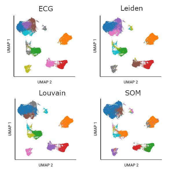
Different algorithms will cluster the same data differently. In this example, the same file was analyzed using UMAP plus each of the clustering algorithms. Fifteen SOM gates were created as a starting point of analysis; ten had populations of significant size. The ten largest gates from Louvain, Leiden, and ECG algorithms are also shown.
To create gates on an analysis run with SOM clustering:
Howto
- Go to Gating.
- Under Tools, click Create cluster gates.
- In the prompt, type the number of gates you want to create, and click Create.
Populations clustered by PhenoGraph algorithms are ordered from largest to smallest by gate number (i.e. Louvain 1 would be the largest cluster). Higher-numbered clusters may be extremely small. This is a departure from PhenoGraph, which uses a min_cluster_size as a cutoff; any clusters smaller than min_cluster_size are grouped together into one outlier population. The downside with this approach is you must decide ahead of time what that cutoff is, potentially obscuring subpopulations or requiring multiple iterations of analysis. To maximize flexibility, CellEngine preserves all clusters. You can choose to ignore higher-numbered clusters, or create your own outlier gate to group higher-numbered clusters.
Once you have cluster gates, create flow plot(s) and box plot(s), similar to Approach 1 and Approach 2.
Howto
- Create a new illustration.
- Insert a pivot table using the button in the toolbar.
- Apply the following settings:
- Dimensions ⮞ Columns Populations: Your cluster gates. Depending on the clustering algorithm, these will be named Leiden/Louvain/ECG/FlowSOM, followed by the gate number. SOM gates are named [total gate number].[gate number] (e.g. FlowSOM 10.2 is the second cluster gate out of ten total).
- Dimensions ⮞ Columns ⮞ check the overlay button
- Dimensions ⮞ Rows An annotation and its values of your choice, sufficient to select the conditions you want to view; or alternatively, FCS Files and the files you want to view.
- General ⮞ Y Channel and General ⮞ X Channel UMAP 1 and UMAP 2, t-SNE 1 and t-SNE 2, or PCA 1 and PCA 2.
- Insert a box plot using the button in the toolbar.
- Apply the following settings:
- Dimensions ⮞ Axis Labels Channels, and your channels of interest.
- Dimensions ⮞ Legend Entries Populations: Ungated and one or more of your cluster gate populations.
- Scaling and Range Optionally set Scaling to Log10 or Scaled and/or adjust the Range Min and Range Max to improve visibility of data with a large dynamic range.
Tip
Using annotations for the pivot table Rows instead of manually selecting FCS files can increase speed, flexibility, and power of analysis. For example, you could use annotations to make plots comparing timecourses, treatments, tissue types, or other variables, with no need to look up metadata manually. Pivot tables describes how files are chosen from annotations.
Approach 4: Using pivot tables to compare gross differences in plot structure
The examples in the approaches above show biological replicates, which are expected to have highly similar embeddings (blob organization or plot structure). However, in some experiments, the embeddings will not be as similar. For example, samples from diseased patients may have more or fewer populations than samples from healthy controls owing to the immune response or presence of cancer cells. In these scenarios, comparing gross differences in the plot structure can be useful.
These comparisons can be performed by inserting pivot tables as described in the first half of Approach 2.
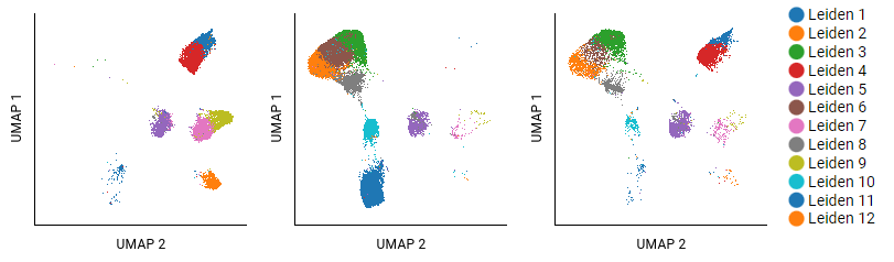
This example analyzed T cells from three different donors with cancer by using UMAP and Leiden algorithms. Eighteen clusters were identified; the largest twelve are shown. The settings for the pivot table show donors as columns, and populations as overlaid rows (selecting Leiden 1 - Leiden 12). Some clusters, like Leiden 5, show small shifts in structure that do not carry meaning. Clusters that are absent in certain samples (like Leiden 8) are more interpretable.
Warning
As noted above, use caution when trying to interpret plot structure: using different algorithm settings can produce dramatically different results, cluster sizes are meaningless, the distances between clusters might not mean anything, and shapes can appear in both random noise and in real data. See The Specious Art of Single-Cell Genomics and How to Use t-SNE Effectively for excellent advice on this topic. The same advice generally applies to UMAP. Instead, generally focus on the absence vs. presence of clusters between samples.