Flow Plots
Both 1D (histogram) and 2D (biaxial) flow plots can be placed individually, or generated and arranged based on annotation data as a pivot table.
Creating a Biaxial Plot or Histogram
Howto
- Click on Flow Plot
 in the toolbar.
 - Click in the illustration to place the plot.
- In the sidebar, under FCS File, select the file you want to plot by clicking on the file name and then click on a selection in the drop-down menu.
- Under Population, click on the population name to display.
- Tip: When you mouse over a population, you can click on the
 button to show the gate on its parent population. If you click the population name, you’ll see only the events from that population instead.
- Tip: When you mouse over a population, you can click on the
- To change the plot axes, click on the axis name under Y Channel or X Channel, and choose from the list of channels.
- Optional: To change the plot type (dot, density dot, contour, or histogram), go to Plot Settings and choose a different Plot Type.
- Optional: Adjust the plot styling.
Gating Hierarchies
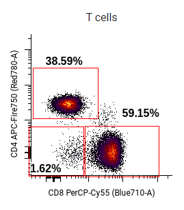
One common use of individual flow plots is for displaying a gating hierarchy. Hierarchies can be generated using the built-in gating hierarchy tool, or manually created with arrangements of flow plots (possibly also with arrows, text boxes, and other components). The plots generated with the tool are functionally identical to manually generated plots, and have the same options.
The gating hierarchy tool has several layouts, which can display the lineage of a single population or a branching hierarchy.
Example: Parent gates for a single population
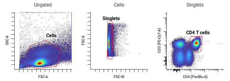
To create a horizontal or vertical row of plots, similar to the manual gating hierarchy example above:
Howto
- Click on Gating Hierarchy
 in the toolbar. A dialog will open.
 - In the dialog, choose Across or Down to arrange plots in a row or column, respectively.
- Choose a population. In this example, CD4 T cells was the population selected.
- Click Insert. The dialog will close and a preview of the hierarchy will appear.
- Click in the illustration to place the plots.
- Optionally, adjust the styling of the selected plots. For this example, Plot Settings ⮞ Color Scale was changed to jet.
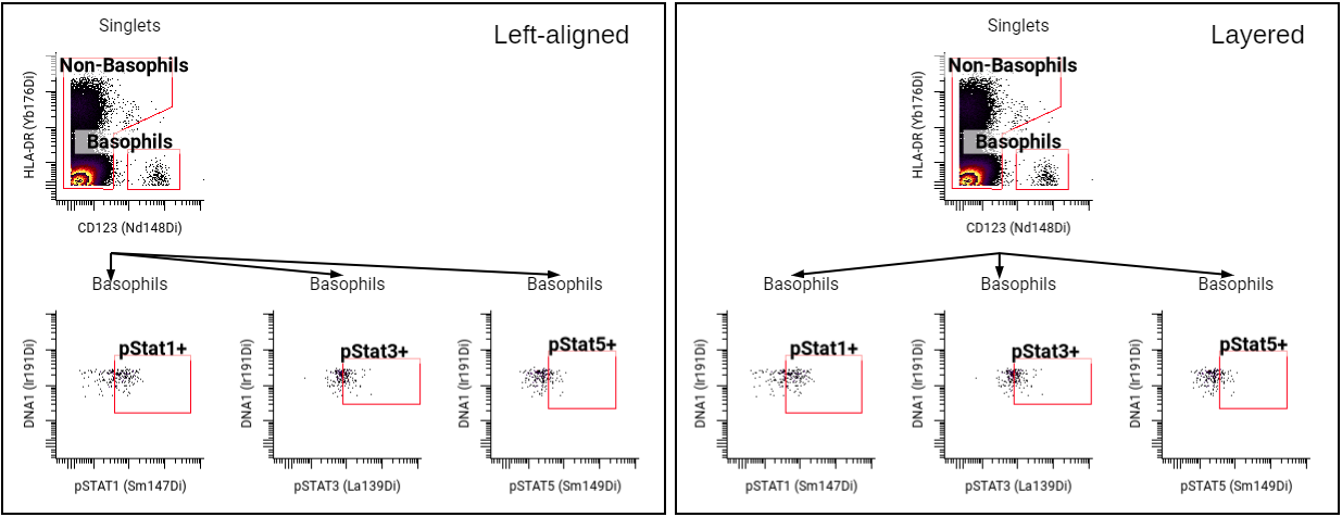
Example: Create a branching gating hierarchy
The gating hierarchy tool can generate plots arranged into branching hierarchies, based on two layouts. Both layouts add arrows to show relationships between plots.
- Left-aligned graph layout places the first plot in the upper left-hand corner of the layout. Plots showing child gates are placed directly beneath the parent plot, moving right as needed.
- Layered graph layout centers the top plot, and positions plots showing child gates centered below the parent.
Here are examples of a small gating hierarchy generated with each layout:
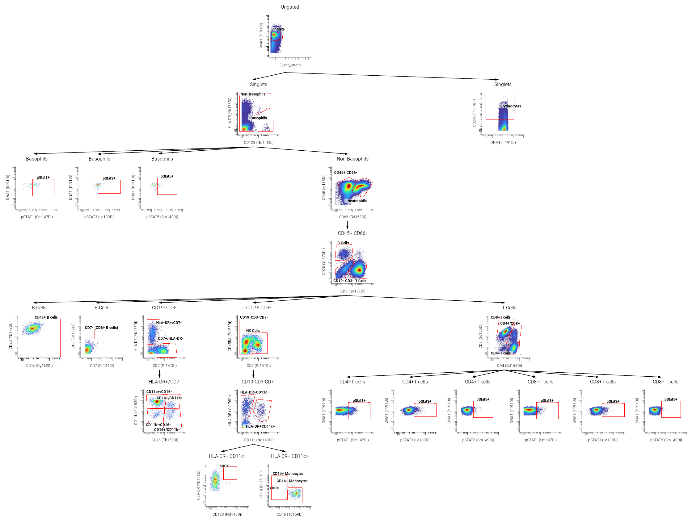
The tool can be used to create larger hierarchies, as with the example below (click to enlarge):
To use the gating hierarchy tool to create a branching layout:
Howto
- Click on Gating Hierarchy in the toolbar. A dialog will open.
- In the dialog, choose Left-aligned graph or Layered graph to determine the layout. A layered layout was used for the example figure above.
- Select populations to include. To show all gates, use select all visible
 . This example selected only the gates shown at the lowest level of each branch, like pStat1/3/5, Erythrocytes, and pDCs.
 - Click Insert. The dialog will close and a preview of the hierarchy will appear.
- Click in the illustration to place the components.
- Optionally, change the plot styling. To change styling of all the flow plots:
- Select one plot.
- Click on Edit ⮞ Select ⮞ Same Type
- Adjust the plot styling. The example above changed Plot Settings ⮞ Color Scale to jet.
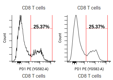
Example: Creating a gating hierarchy manually
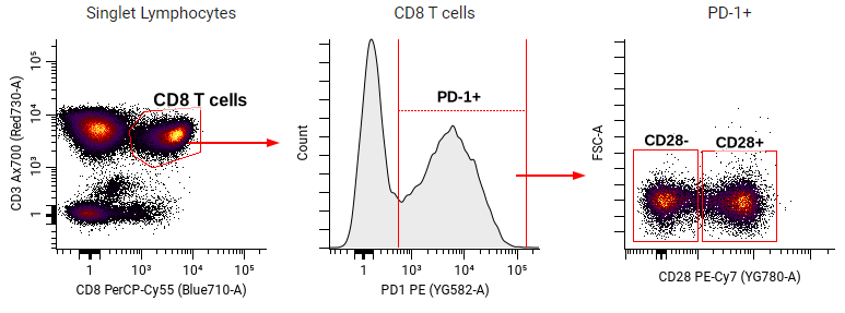
Flow plots can also be manually placed to create gating hierarchy figures. To create the example above, a first flow plot was placed as described under creating a biaxial plot or histogram. The settings for the left biaxial plot were:
- General ⮞ FCS file: For this example, we chose a stimulated sample with exhausted T cells.
- Population: Singlet Lymphocytes
- Y and X Channel: CD3 and CD8
- Gates ⮞ Gate Labels: Name
When making a gating strategy, it’s often easiest to copy and paste the previous flow plot. The histogram was made by copying the previous plot, and then changing:
- General ⮞ Population: CD8 T Cells
- X Channel: PD1
- Plot Settings ⮞ Plot Type: Histogram
- Histogram Fill Opacity: 8
- Gates ⮞ Gate Label Size: 14
The final plot was a copy-paste of the histogram, with the following changes:
- Plot Settings ⮞ Plot Type: Dot - Density
- General ⮞ Population: PD-1+
- Y and X Channel: FSC-A and CD28
- Axes and Legend: Tick labels were turned off
As a final touch, arrows were added from the toolbar to indicate the relationship of the plots. Many other styling options are possible for flow plots.
Example: Coloring a dot plot by a channel
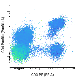
Dot plots can be colored using any of the channels in the FCS file. The example above is colored by CD20 to identify the B cells relative to CD4+ and CD4- T cell populations.
Howto
- Place a Flow Plot in the illustration.
- In the sidebar, choose an FCS file, population, and axes. For the example above, the Y and X Channel were set to “CD4” and “CD3”.
- Under Plot Settings, change the Plot Type to Dot.
- Under General, click on the Color Channel, and choose a channel to color the plot.
- Optional: The example above changed the Color Scale to jet.
Subsampling
When subsampling is used, a figure will display a randomly selected subset of events to display. Subsampling a population can be helpful if there are a large number of events to display or when you are comparing populations or samples of different sizes (e.g. you are making a plot overlaying basophils on neutrophils).
Howto
- Click on your preferred subsampling mode. Percentage chooses a percentage of the original population. Absolute Count restricts the number of events to a specific number.
- Click on Before Gating or After Gating to determine whether subsampling occurs on every event in the file, before gating is applied, or only on the events in the selected population after gating is applied.
- Type a number into Subsample Percentage/Subsample Count (depending on whether you chose Percentage or Absolute Count) for the percentage or number of events to show.
- Optional: Type a number into Random Seed. Choosing a seed will keep the selection of events consistent.
Warning
Improper use of subsampling can create false impressions of data by distorting the apparent abundance of different populations.
Plot Styling
Some data visualization options are common to all graph types, but some options are unique to flow plots.
Dot size
Larger dots are possible for dot plots. Under Plot Settings, dot size can be changed between 1x1, 2x2, and 3x3 squares.
Color
Plot Settings offers several color scales for biaxial plots.
| Name | Palette |
|---|---|
| Warm |  |
| Jet |  |
| Cividis |  |
Contour plots also offer a black and white option.
Tip
Consider accessibility when choosing a color scale for your data. Cividis’s blue-yellow gradient has perceptually linear brightness. Cividis data visualization is optimized for people with or without color deficiencies, and converts to grayscale without loss of information.
For more information:
- Nuñez J. Anderton C., Renslow R. Optimizing colormaps with consideration for color vision deficiency to enable accurate interpretation of scientific data at https://journals.plos.org/plosone/article?id=10.1371/journal.pone.0199239.
Adjusting colors by channel
When coloring a plot by a channel, channel scales determine how the color scale is applied.
-
The minimum and maximum of the color scale map to the minimum and maximum of the channel scale. If an event's value is below or above the scale range, it will use the minimum or maximum color.
-
The scale's cofactor also affects the color scale. A lower cofactor reduces compression around zero, making it easier to visualize differences at the lower end of the scale. Increasing the cofactor allows for better visualization of differences in brighter clusters.
Tip
Adjusting scales can make it easier to visualize dim markers, or highlight events that are beyond the minimum or maximum threshold. Appropriate values depend on multiple factors. For example, reducing the maximum scale value can make it easier to visualize dim markers. On the other hand, a PBMC sample should be uniformly positive for CD45, so setting the minimum too high might imply some cells are negative.
Smoothing
Flow plots can be visually smoothed by changing the Plot Settings. If the smoothing is zero, no smoothing is applied; higher numbers increase smoothing. Above are examples of smoothing settings of 0 (left) and 1 (right) for the same data.
Both undersmoothing and oversmoothing can lead to misleading graphs of data. Undersmoothed plots, especially on small data sets, will emphasize individual peaks, obscuring the similarities of close samples. However, smoothing values that are too high will inappropriately merge peaks, reducing or even eliminating distinct populations. Oversmoothing is especially a concern when positive and negative aren’t clearly separated, which can be unavoidable for some studies.
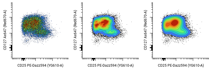
The contour plots above, taken from the same FCS file, show how smoothing settings can obscure the data. The image on the left has no smoothing. The undersmoothing results in “cold spots” that make the plot hard to interpret. The plot on the right is oversmoothed, making it hard to distinguish whether the events are from the same population or not.
For more information, see https://aakinshin.net/posts/kde-bw.
Gates
The Gates section shows or hides gates on a flow plot, and adjusts the gate label size and content. By default, the gate label will display the percent of the parent population within a gate. This option can be changed to the gate name or a variety of statistics, including median, standard deviation, or event count.
Tip
Flow plots (especially when displayed in pivot tables can be helpful for reviewing gating. To adjust a gate, right click on the plot and select View in gating.
Labeling and tick marks
The Axes and Legend section controls allow turning on and off tick marks, tick labels, and axis labels.
Contour plot styling
Contour plots have additional options, all available under Plot Settings in the sidebar.
Percentile Start specifies the first percentile band; a value of 10 means that events below the 10th density percentile will be shown as individual dots (outliers) instead of within a contour. Events below this threshold this will appear as black dots.
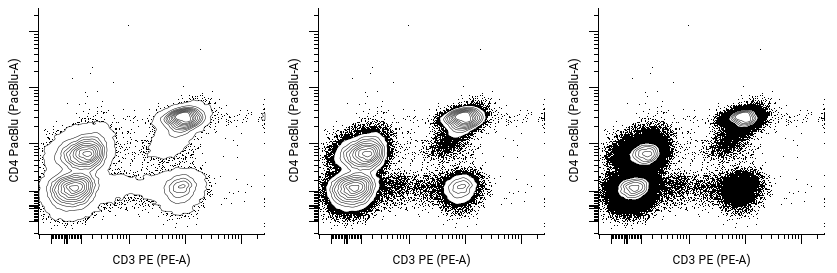
This example shows plots with percentile start of 1, 10, or 50. It also uses the unfilled Color Scale, which is unique to contour plots.
Percentile Step controls how large each contour is; a value of 10 will create contour bands that each contain 10% of the events in a plot.
Histogram styling
Histogram line thickness and fill opacity can be adjusted under Plot Settings.