Bar and Line Charts, Box Plots, and Heatmaps
These statistics plots use a setup interface similar to pivot tables of flow plots. However, any number of FCS files can be displayed, making them ideal for summarizing replicate data. Annotations are used to select which FCS files to display. Annotations can also be used to define additional dimensions for line charts and heatmaps, creating pivot tables of statistics plots.
Bar charts, line charts, and heatmaps show the arithmetic mean of all matching files, along with either the standard deviation or standard error of the mean (see replicate data). Box plots show the median line flanked by the first and third quartile, with whiskers spanning ±1.5 times the inter-quartile range and individual points for each sample in the plot.
Tip
If you want to plot only a subset of your replicate data, for example a specific timepoint, treatment, or demographic group, use filter annotations.
An FCS file will be omitted from a plot in the following scenarios:
- When showing channel statistics (e.g., means or medians) and the file has no events in the selected gate.
- When showing the geometric mean and the file has events with negative values or zeros, in which case the geometric mean cannot be calculated.
Additionally, box plots omit FCS files when the plot is log-scaled and the statistic is negative or zero. Bar and line charts and heatmaps include zeros and negatives when calculating the mean of multiple files, but the mean will not be displayed if it is negative or zero.
Scaling and Normalized Plotting
When looking at changes in data, such as cell signaling before and after treatment or changes in population frequencies over time, you can display normalized data in heatmaps, bar charts and line charts.
Howto
- Set up your plot as described in the pivoting model. For example, to look at signaling markers under various stimulation conditions in a heatmap, set the row annotations to your cell signaling readouts and the column annotations to your stimulation conditions.
- Select a normalization method from the scaling & normalization selector. For fluorescence-based signaling experiments, Log2 Ratio is common. See the table of scaling and normalization methods below for more information.
- Select values to which to normalize the visualization. For example, if your unstimulated condition is in the left-most column, select Left Column. You may need to manually adjust the sorting order of your annotations so that your normalize-to values are in an appropriate position.
The possible scaling and normalization methods are as follows:
| Method | Equation | Description and Use Cases |
|---|---|---|
| Raw | $$ x $$ | The unmodified value. Commonly used for population frequencies (event counts or percentages). |
| Raw Fold | $$ \frac{x}{c} $$ | Fold change without scaling. |
| Raw Difference | $$ x - c $$ | Use instead of raw fold when the control value is near zero, in which case dividing by a small number amplifies the experimental value. |
| Scaled | $$ \operatorname{Scale}(x) $$ | For channel statistics only. Uses the channel’s scale. This shows the value on the same scale used in flow plots (e.g. gating) and may thus be more approachable. |
| Scaled Difference | $$ \operatorname{Scale}(x) - \operatorname{Scale}(c) $$ | For channel statistics only. Uses the channel’s scale. Commonly used instead of log2 ratio for CyTOF signaling experiments because unstimulated signaling markers tend to be near zero. |
| Scaled Ratio | $$ \operatorname{Scale}(x) / \operatorname{Scale}(c) $$ | For channel statistics only. Uses the channel’s scale. |
| Log2 | $$ \log_2 x $$ | |
| Log2 Ratio | $$ \log_2\left(\frac{x}{c}\right) $$ | Commonly used for signaling experiments because it makes the control value zero, increased values positive and decreased values negative. |
| Log10 | $$ \log_{10}x $$ | Commonly used when visualizing a large range of data, in which case a linear scale would make changes at the low end of the scale difficult to see. |
| Log10 Ratio | $$ \log_{10}\left(\frac{x}{c}\right) $$ |
where \( x \) is the experimental value and \( c \) is the control value.
Replicate Data, Variability, Error and Error Bars
When replicate values are present, the mean of the values will be displayed along with the sample standard deviation (SD) or standard error of the mean (SEM). Bar charts, line charts and heatmaps show the variability or error in the hover text. Variability or error can also be displayed as error bars in bar and line charts.
-
The standard deviation (SD) is an estimate of the variability of the entire population based on the representative set of samples in your data set. This value does not necessarily get smaller with larger sample sizes. This value should be used when you wish to describe the variability of a population.
-
The standard error of the mean (SE or SEM) is an estimate of how precisely you have determined the mean with your experiment. This value gets smaller with larger sample sizes, as it is defined as the standard deviation divided by the square root of the number of samples. This value should be used when you wish to compare between different groups of samples.
Regardless of your choice, you should always report which metric you are showing.
How the SD or SEM is calculated further depends on the selected scaling and normalization, as described in the table below. These formulas propagate measurement uncertainty through the scaling and normalization equations.
| scaling \ normalization | (none) | fold | difference |
|---|---|---|---|
| raw | absolute error (s) | $$ \left\lvert \frac{x}{c} \right\rvert \sqrt{\frac{s_x}{x}^2 + \frac{s_c}{c}^2} $$ | $$ \sqrt{{s_x}^2 + {s_c}^2} $$ |
| log2 | $$ \frac{s}{x \times \ln 2} $$ | $$ \sqrt{\left( \frac{s_x}{x \ln 2} \right)^2 + \left( \frac{s_c}{c \ln 2} \right)^2} $$ | not applicable |
| log10 | $$ \frac{s}{x \times \ln 10} $$ | $$ \sqrt{\left( \frac{s_x}{x \ln 10} \right)^2 + \left( \frac{s_c}{c \ln 10} \right)^2} $$ | not applicable |
| scale set | not supported | not supported | not supported |
where \( s \) is the SD or SEM, \( x \) is the experimental value (mean, median, count, etc.), \( c \) is the control value, \( s_x \) is the SD or SEM of the experimental value and and \( s_c \) is the SD or SEM of the control value.
Limitations
All of these formulas are estimates and make assumptions, including that the experimental and control conditions are uncorrelated (i.e. that there is no systematic bias) and that the error is relatively small.
For more information:
- Cumming G., Fidler F., Vaux D.L. Error bars in experimental biology at https://www.ncbi.nlm.nih.gov/pmc/articles/PMC2064100/.
- Baird D.C. Experimentation: an introduction to measurement theory and experiment design at https://books.google.com/books?id=LicvAAAAIAAJ&pg=PA48. See sections 3.3 through 3.8.
- Propagation of Uncertainty at https://en.wikipedia.org/wiki/Propagation_of_uncertainty.
Bar and Line Graphs
Howto
- Insert a bar graph with the
 button or a line graph using the
  button from the toolbar.
 - Under Axis Labels, click on Name and choose the annotation to display on the x-axis.
- Choose the Values to display.
- Optional: For line graphs, Connect Gaps continues the line through any intermediate axis values that have no data to display (either because there’s no matching file or because the value cannot be calculated).
- Optional: If the axis values are numeric, they will be positioned based on the value. To space numeric values evenly, use Categorical axis labels.
- Under Legend Entries, choose the Name and Values for the lines that will be made on the graph.
- In General, select and population and/or channel if applicable. (In cases where this selection would be redundant or nonsensical, the option will be hidden. Common examples include a graph using populations as axis labels or displaying “percent of parent” statistic instead of a channel-based statistic.)
- Optional: Bar graphs can be reoriented under Plot Settings by choosing horizontal or vertical.
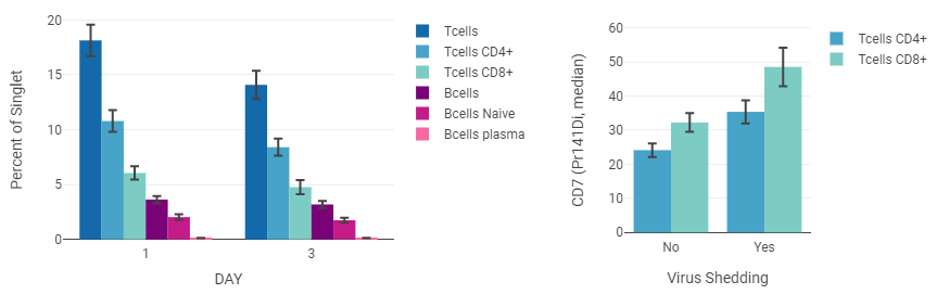
Example: Bar Graph
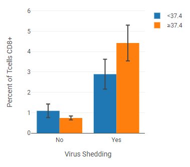
This example shows a cell population with axis labels and legend entries separated by annotations (“virus shedding” and “fever”).
Example: Line Graph
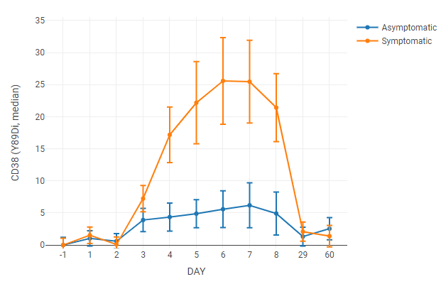
For this line graph, the median value of a channel is tracked over time. Axis labels and legend entries used “day” and “symptoms” annotations, respectively. Axis labels were set to categorical to space the data points evenly on the x-axis (otherwise the data points taken at 60 days would force the first week’s worth of data to the far left of the graph).
The data was normalized to uninfected samples (Day -1) by setting scaling to raw difference and normalization to the left axis group.
Create control charts with threshold lines

To assist with quality control, a line can be added at the mean. Optionally, control limit lines can be placed at multiples of a value above/below the mean. This allows for review of trends over time, and easy identification of outliers based on predetermined criteria.
To add threshold lines:
Howto
- Select the line graph.
- Under Quality Control, enter the value for the line at the mean.
- Optionally, enter the desired spacing of lines above and below the mean as the limit.
- If desired, click on lines at to change whether lines are displayed at 1, 2, and 3 times the limit.
Tip
One common usage for threshold lines is to create Levey-Jennings plots by using the standard deviation as the limit. Identification of outliers can then be carried out using rules, such as those suggested by Westgard.
Review staining profiles from line graph points

Data points can be selected on line charts and dose response curves by clicking and dragging. The individual plots that make up the selected points are displayed under the Analysis tab of the plot options. This can be particularly useful in case of outliers to check the underlying data for gating errors, staining issues, or other problems.
To view other, related plots for comparison:
Howto
- Click the dropdown beneath show related files with the same.
- Select one or more annotations to select matching files.
- Optionally, to refine the file selection further:
- Click Add Criteria, and choose an annotation for filtering.
- Click on the dropdown and choose the values to match files to.
- Repeat steps a and b to add additional criteria as needed.
For example, to compare the selected point(s) to control files from the same batch, the settings might look like this:

Once the plots have been selected, the plot settings, sort order, and displayed metadata can be further refined.
Howto
- Adjust plot settings by clicking on the
 . From there, select the desired gate label, smoothing, and color palette for the plot.
 - To sort the plots:
- Click on
 .
. - Select Add Field, and the desired sort value.
- Select whether to sort in ascending or descending order.
- Repeat steps b and c to add additional sort conditions.
- Use the arrows to adjust the order of fields.
- Click on
- Select the displayed metadata for each plot by clicking on
 , then select the names of annotations to show.
Box Plots
Box plots are useful for displaying the distribution of samples within a group. Box plots show the median line flanked by the first and third quartile, with whiskers spanning ±1.5 times the inter-quartile range. In addition, box plots display a dot for each sample.
Tip
Mouse-over a dot on a box plot to see more information, including the FCS file and its statistic.
Creating a box plot
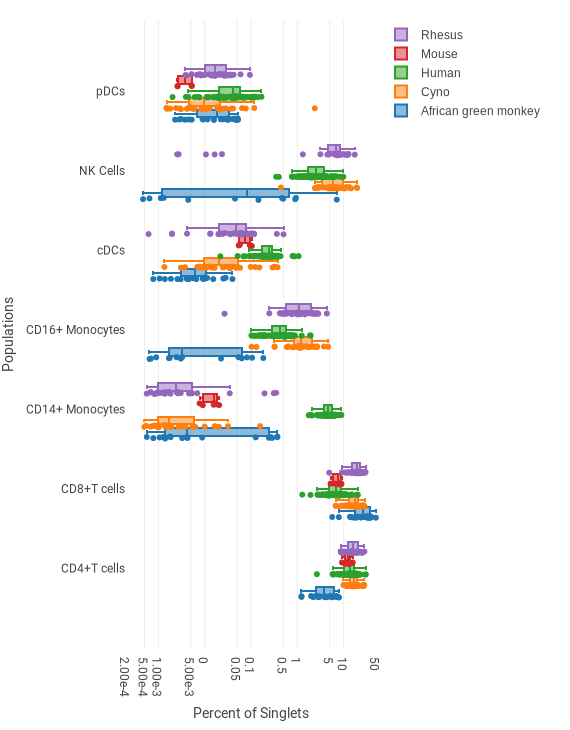
This example shows the frequencies of several cell types for five different species, based on several dozen biological replicates per species. A single dot is shown for each donor. The box shows the lower quartile, median and upper quartile. The whisker spans ±1.5 times the interquartile range.
Howto
- Insert a box plot using the
 button
in the toolbar.
button
in the toolbar. - Set up the pivot table dimensions as described in the pivoting model.
In the example above, the settings are as follows:
- Axis Labels Populations: pDCs, CD14+ Monocytes, CD16+ Monocytes, cDCs, NK Cells, CD4+ T cells, CD8+ T cells
- Legend Entries (Data Series) Species: African green monkey, Cyno, Human, Mouse, Rhesus
- Select the statistic and scaling in the the sidebar. In the example above, “Percent of” and “Singlets” are selected, and scaled by Log10 to improve visibility of the large range of values.
Heatmaps
Adding annotations
File annotations can be used as column or row entries, but they can also be added as categorical data to existing heatmaps. This is often particularly useful when heatmaps with individual samples or donors are used. The clustered heat map example shows column annotations for symptoms and viral shed of individual donors.
To add annotations:
Howto
- In the sidebar, under Heatmap Annotations, click on Column Annotations or Row Annotations.
- Select one or more annotations from the list.
- Optional: Click on the arrows beside the annotation name to change the order of the displayed annotations.
Heatmap styling
Color scale
Like biaxial plots, heatmaps offer a range of gradients to choose from under Plot Settings.
Normalized heatmap
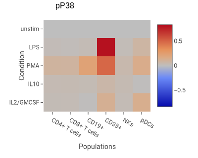
This example shows the degree of change in phospho-P38 in response to four stimuli in six cell types.
Howto
- Insert a heatmap using the
 button
in the toolbar.
button
in the toolbar. - Set up the pivot table dimensions as described in the pivoting model. In the example above, the settings are as follows:
- Columns Populations: CD4+ T cells, CD8+ T cells, CD19+, CD33+, NKs, pDCs
- Rows Condition: IL2/GMCSF, IL10, PMA, LPS, unstim
-
Select the statistic and scaling in the the sidebar. In this example:
- Statistic Median
- Channel pP38
- Scaling Scaled difference. This is a common normalization method with CyTOF data akin to fold-change in fluorescence data.
- Normalize to Top Row. This makes the top row have the value 0; all other rows are normalized relative to the top row.
See Scaling and Normalized Plotting for more information about the last two settings.
Channel rescaling
When visualizing multiple channels in one heatmap, bright markers can dwarf the signal from dim markers. To address this, you can select Rescale Channels Equally under Scaling and Range in the sidebar. This rescales each channel’s row or column to run from 0 to 1.
When using rescaling, be aware of the following:
- Rescaling is applied after the selected scaling method (e.g., log10), with the caveat that rescaling cannot be applied if a normalized scaling method (e.g., log10 ratio) is used.
- When showing correlation heatmaps, the rescaling is applied before calculating the correlation coefficients.
Clustered heatmap
Heatmap columns and rows can be clustered with a variety of hierarchical clustering methods.
-
Single linkage measures the cluster distance by using the minimum distance between components.
-
Complete linkage measures distance using the maximum distance between components.
-
Average linkage measures cluster distance using the mean distance between components.
-
Ward’s method does not directly measure distance, instead minimizing the variance between clusters.
For more information:

The example above uses average linkage to cluster samples from donors with influenza. Heatmap annotations for viral shedding and symptoms were added to the columns.
To make a clustered heatmap:
Howto
- Insert a heatmap using the button
in the toolbar.
- Set up the pivot table dimensions as described in the pivoting model.
In the example above, the settings are as follows:
- Columns Donor (annotation): all values
- Rows Day (annotation): -1, 1, 2, 3, 4, 5, 6, 7, 8
- Select the statistic and scaling in the the sidebar. In this example:
- Population: MCs, as a percentage of an ancestor gate
- Scaling: Raw difference x-control
- Normalize to bottom row (timepoint before infection)
- Under Heatmap Clustering, check one of the cluster options, the % of the graph space to allow the clustering diagram to occupy. In this case:
- Cluster columns
- Size is 20
- Select Linkage and Line thickness. This example uses:
- Average linkage
- Line thickness of 1.5
- Optional: Add heatmap annotations by clicking on the drop-down box under column or row annotations and clicking on the checkboxes.
- The example uses virus shedding and symptoms.
Heatmap correlation
Heatmaps can be used to show the correlation of experimental variables. This can be useful to show the coexpression of signaling molecules, the coordination of different cell types, or other instances where variables in the same group could affect or coincide with each other.
Heatmap correlation uses Pairwise Rows/Columns to decide what to display. Correlated Vectors generate correlation vectors for the row values.
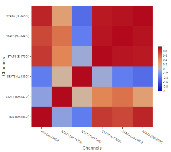
The example above shows correlation of signaling molecules, using the channels of molecules of interest as Pairwise Rows/Columns, and cell phenotypes created by gating as Correlated Vectors.
Correlation coefficient calculations
CellEngine offers three methods for calculating correlation. The appropriate method depends on your data.
Pearson requires the data to be normally distributed, not have significant outliers, and have a linear relationship.
Spearman uses ranked data and is suitable for any distribution (not necessarily normal) with any monotonic relationship (not necessarily linear). It is sensitive to error and thus not well suited to data with outliers.
Kendall also uses ranked data and is suitable for any distribution with any monotonic relationship. It is more accurate than Spearman when the sample size is small and is less sensitive to error, making it useful when there are outliers. Overall, it is more robust than Spearman.
For more information:
- Equations for Pearson, Spearman, and Kendall.
- Schober P., Boer C., and Schwarte A. Correlation Coefficients: Appropriate Use and Interpretation at https://pubmed.ncbi.nlm.nih.gov/29481436/.
- Discussion of Kendall at https://stats.stackexchange.com/a/18136/100300/.
Creating a correlation heatmap
Howto
- Insert a heatmap using the button in the toolbar.
- In Heatmap Correlation, click on Correlation Coefficient, and choose a correlation coefficient method.
- In the sidebar, under Pairwise Rows/Columns, click on Name and choose the variable you want to display.
- Click on Values and select the values for the heatmap axes.
- Under Correlated Vectors, choose the Name and Values that will build the vectors used to calculate the correlation coefficients.
Plot Styling
Color options
Color options vary depending on the kind of data being displayed. Color scales are a continuous range of colors, used by density dot plots and heatmaps to display data. Color palettes are used by bar graphs, line graphs, box plots, and other figures to distinguish different data groups from each other.
Customizing color palettes
CellEngine offers several default color palettes, including a low-contrast and an achromatic option, but palettes can also be expanded or customized entirely.
To change a palette:
Howto
- Select a figure.
- Under Plot Settings, click on the dropdown menu to select an existing palette, or click on Edit. The color palette customization dialog will open.
- Add or remove colors with the
 or
or  buttons until the palette contains the desired number of colors.
 - To change colors individually, click on each color swatch you want to modify, then select a new color with the color selector.
- To change multiple colors simultaneously:
- Copy a list of hex values. To copy a palette from another experiment, open the palette editor as per steps 1-2 above, and select Copy palette.
- In the destination palette, click on the hex value of the first color you want to replace.
- Use the keyboard shortcut to paste the list.
- Use the up or down arrows next to each slot to adjust the color order.
- Select on Save Copy to create a new palette, or Save Changes to modify the one you’re working on.
Tip
When making color selections, consider whether your figure will be accessible to people with color-vision deficiencies or when printed in grayscale.
For more information:
- Crameri F., Shephard G.E., Heron P.J. The misuse of colour in science communication at https://www.nature.com/articles/s41467-020-19160-7.
Assigning colors from a palette
By default, a figure will assign colors from a color palette to data series in sort order. However, annotations, populations, and channels can be assigned to palette colors. The example above color-codes the populations so that they are the same color in every figure.
Color assignments can be applied across an experiment, illustration, or on a component level. Like sorting, these assignments are hierarchical; if a color assignment is not defined at one level, the next level’s assignment is used. For example, if there is no color assignment for a plot, it will use one set for the illustration.
To create a custom color assignment for a palette:
Howto
- Select the figure you want to customize.
- In Plot Settings ⮞ Color Palette, click on Edit next to the color palette to open the color palette customization dialog.
- Select a Property from the drop-down box.
- Choose whether your customization should Apply to the Experiment, Illustration or Selected Component.
- Under Assign colors, choose an option:
- Sequentially is the default; the colors will be assigned sequentially based on the sort order of the values.
- Manually allows you to choose specific colors for specific values.
- Using Illustration assignments or Using Experiment assignments uses the settings assigned to the illustration/experiment level.
- Click on the drop-down box next to each color that you want to assign, and choose one or more values to assign to the color. If needed, adjust or add colors to the palette.
- Repeat for each property that you want to assign to the color palette.
- Click on Save Assignments to finalize your settings.
Tip
A dot next to the name of a property or application level indicates that a change has been made, to make it easier to review your changes before saving.
Labels
The font size of legends, axis labels, and tick labels can be changed in the Axes and Legend section of the sidebar.